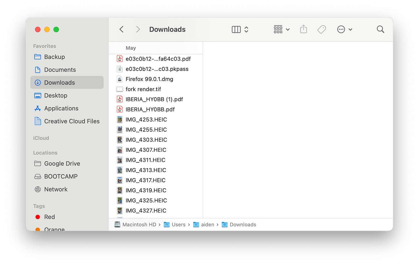
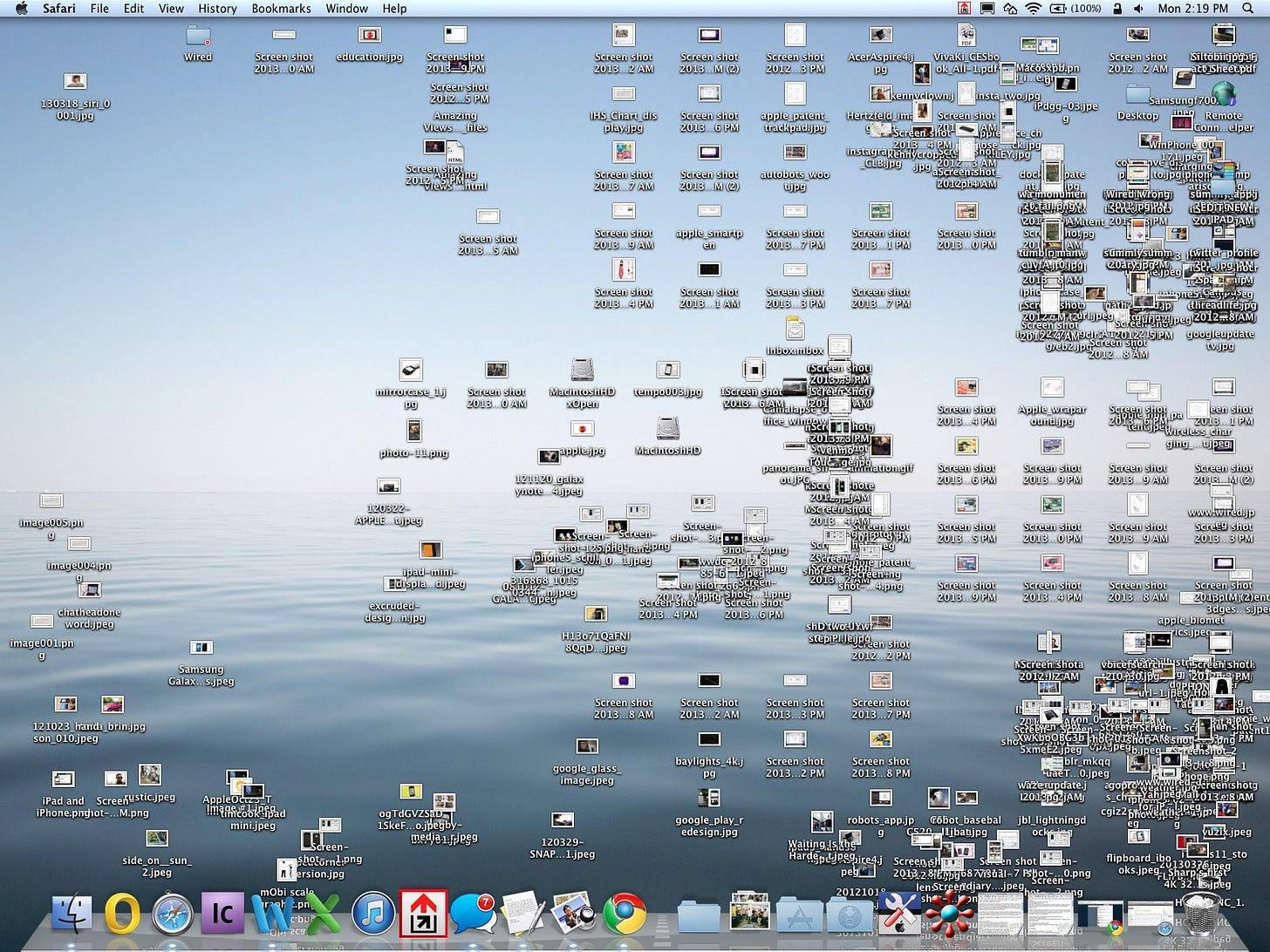
The desktop is broken.
How our digital lives became confined to a filing cabinet, and how we can change it.
Every day I spend hours inside of the world’s largest filing cabinet. An immense space of endlessly nested information, placed in an absolute, linear hierarchy. The system is complex and made more complex by my own inability to organize it. Years pass and my indexing style changes, folders sprout into each other and file names fluctuate between underscores & dashes—I’m making it up as I go along.
My computer feels like a strange, archaic space. Its inner workings are unintuitive and foreign, but I’ve spent so much time inside the system it’s hard to think of an alternative. It feels unchangeable, simply the way things are.
But, that’s not really true. The current “desktop metaphor” isn’t very old and its prevalence is mostly due to a handful of large businesses consolidating around a single model.
What even is the desktop?
The desktop metaphor is the current standard interface for personal computing. Under this model, the user is presented with a metaphorical desktop covered in common office objects like files, folders and trash cans.

Early in the development of GUIs, it was thought that a direct metaphor for physical objects would help ease the office workers of today into the computers of tomorrow. This approach made two assumptions that rapidly became outdated:
Users are unfamiliar with computers
Users are doing office work (writing, filing, organizing)
For decades, people have pointed out that the desktop metaphor is doomed to become dated as computers become the dominant mode of work. In 1996, Jakob Nielsen wrote "the next generation of users will make their learning investments with computers, and it is counterproductive to give them interfaces based on awkward limitations of obsolete technologies".¹ We’ve also significantly expanded the use cases for computers without updating our interfaces. An office just isn’t the right environment to socialize, play games, or create art.
Why things are the way they are
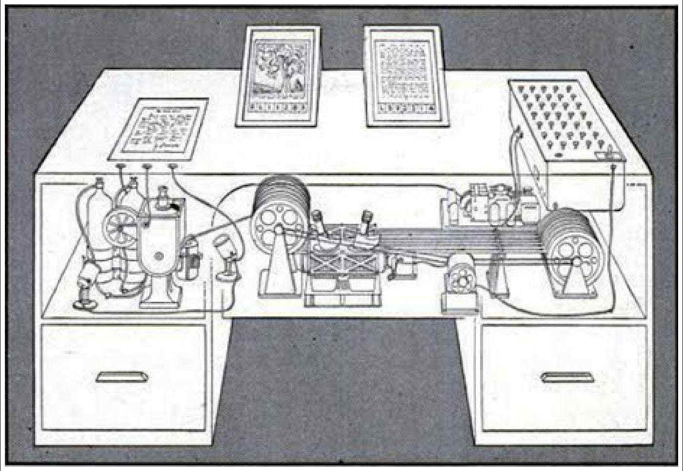
The earliest example of this system can be traced all the way back to 1945, when Vannevar Bush published As We May Think, calling for the scientific community to redirect their effort away from the destructive goals of war.² To explain his vision of amplified knowledge, he described a Memex, a hypothetical machine to manage & read an immense library of information. As described, the Memex is an impractical, desk-sized contraption full of moving parts and delicate film. But, it introduced revolutionary concepts like linking, associative searching, and screen-based viewing & editing.
At the same time, the US Army was financing the creation of the first digital computer, ENIAC.³ This offered huge advantages over current electro-mechanical solutions, but it would be decades before digital computers could be used by anyone other than highly trained experts.
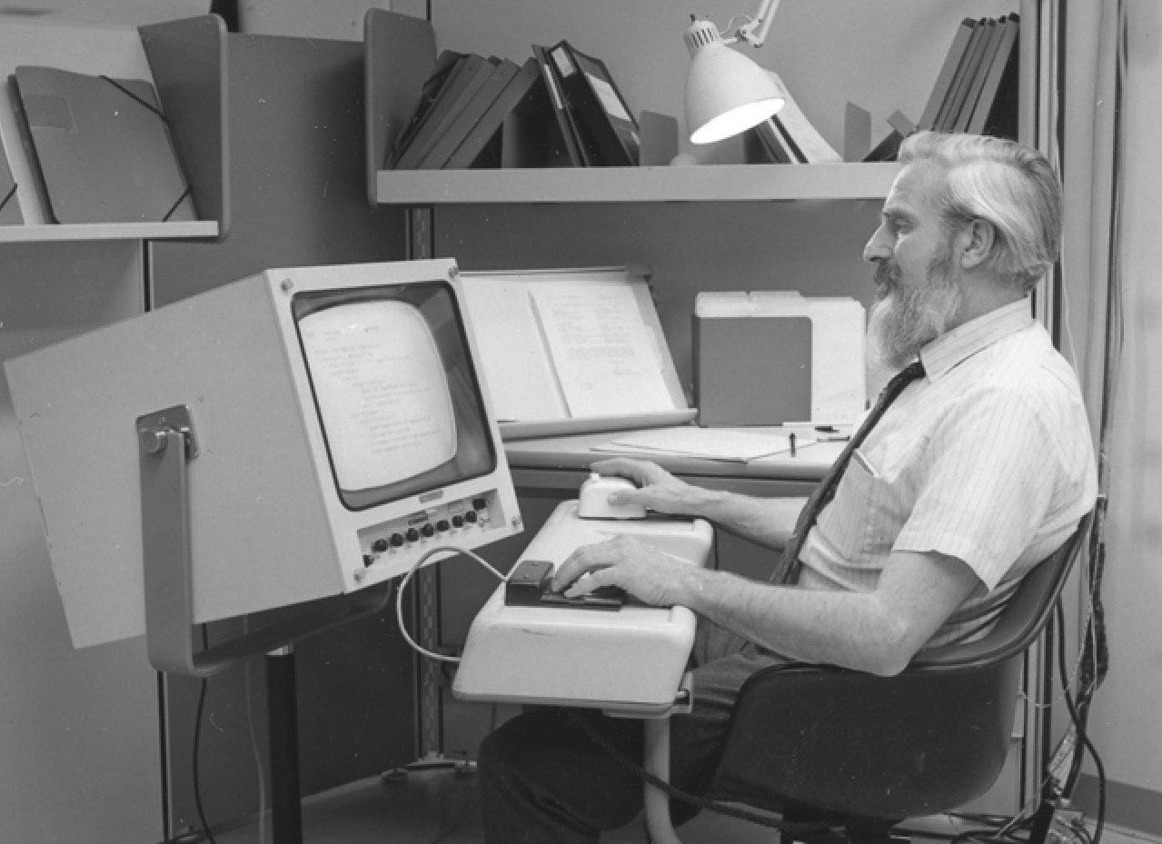
A 20 year old radar technician named Douglas Englebart read As We May Think when it was published. Inspired by Bush, he would later drive the creation of a computer system featuring an intuitive interface, in many ways turning Bush's dream into a reality.⁴
After completing his Ph.D, Englebart published Augmenting Human Intellect, laying out a proposed research plan.⁵ This paper helped him secure funding to found the Augmentation Research Center (ARC). The team at ARC would go on to develop the oN-Line System (NLS), a radically inventive computer that established the baseline for personal computing.⁴
This work was unveiled to the public in 1968 at an event that later came to be known as The Mother of all Demos.⁶ In this demo, Englebart efficiently navigated through a graphic interface, showing off layered windows, hypertext, graphics, video conferencing, mouse inputs, word processing, dynamic file linking, version control, and collaborative real-time editing.
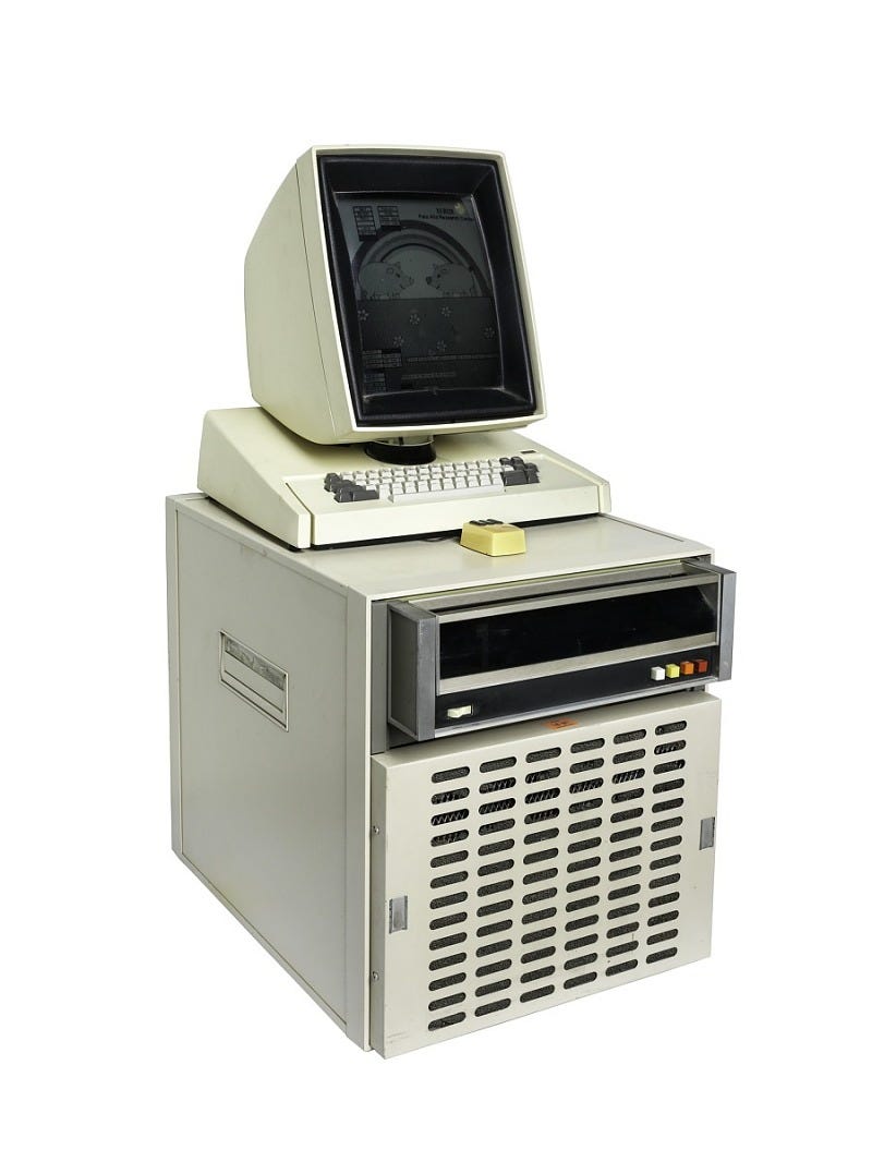
The NLS system inspired teams like Xerox PARC, who would develop Alto, an early GUI that relied on the desktop metaphor. They assumed that work would be constructed on the computer and then printed—a logical step for a company known for photocopiers. This "what you see is what you get" mentality was so pervasive that the Alto's screen was the size and orientation of a standard letter sheet.⁴
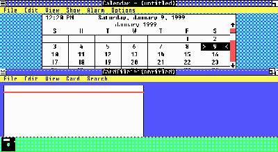
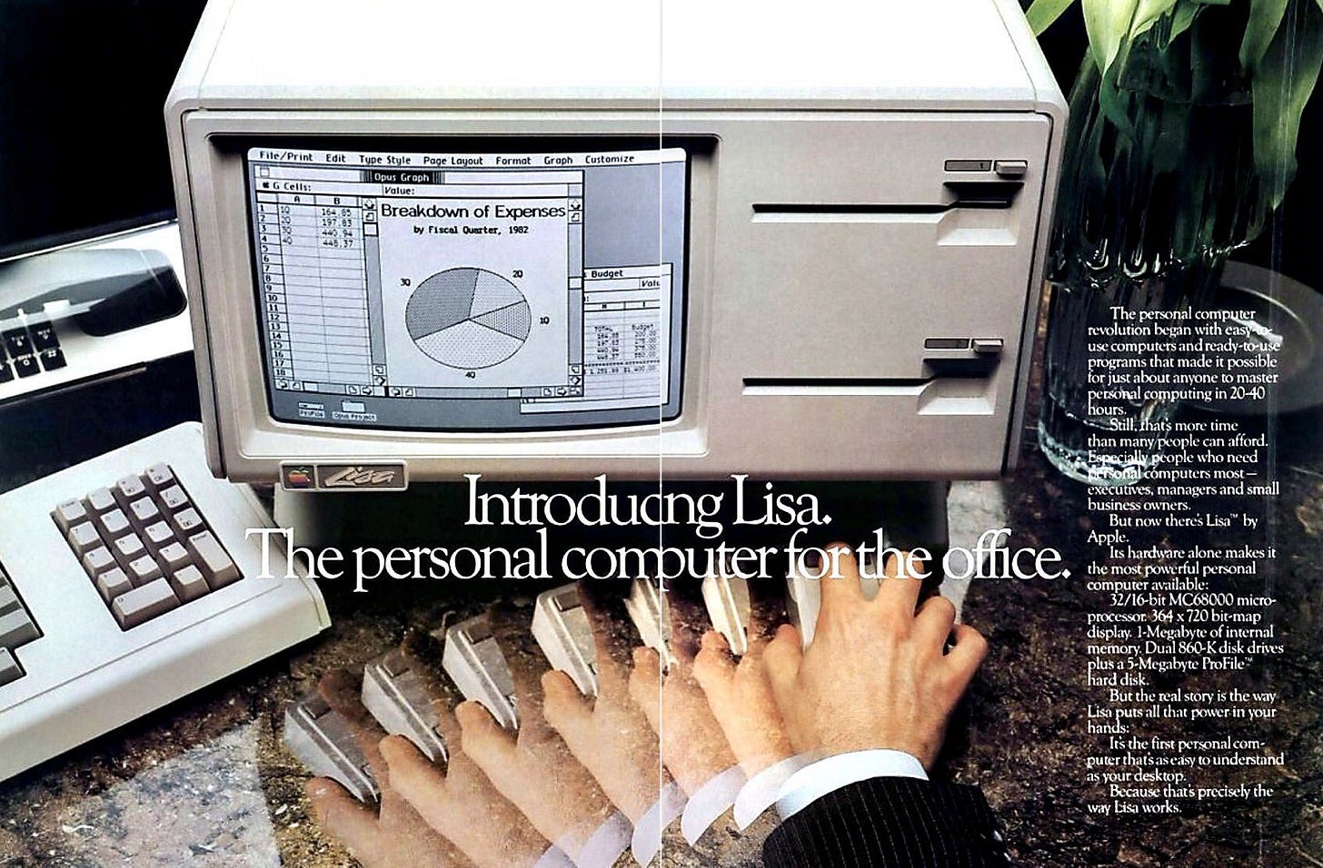
Alto was never released, but it heavily influenced Apple's first OS, Lisa. After Lisa, Windows 2.0 adopted a similar interface—so similar that Apple sued Microsoft over the design.⁴ Apple lost the case and, by the late 80s, the desktop model was cemented in place.
The desktop
Early personal computers were marketed to a very specific consumer, despite their creator's goals of universal intellectual augmentation. Looking back at early ads for the Apple Lisa, we see suited executives working at increased speeds in well appointed offices. They helpfully inform us that "familiar symbols simulate the way you work at your desk". It's clear from the ads that Lisa is intended for a specific set of knowledge workers that need to easily create and read a relatively small set of documents.
By this point, the list of businesses who created operating systems had shrunk, leaving only Apple & Microsoft as the big players. Both had committed to the desktop system and evolution began to stagnate. Meanwhile, many of the brilliant people who had created the earliest interfaces continued to push for progress. Jef Raskin, founder of the Macintosh project, would later say: “Regrettably, the design of interfaces has taken a wrong turn, leading to a level of difficulty unjustified by technological or logical necessity”.⁷
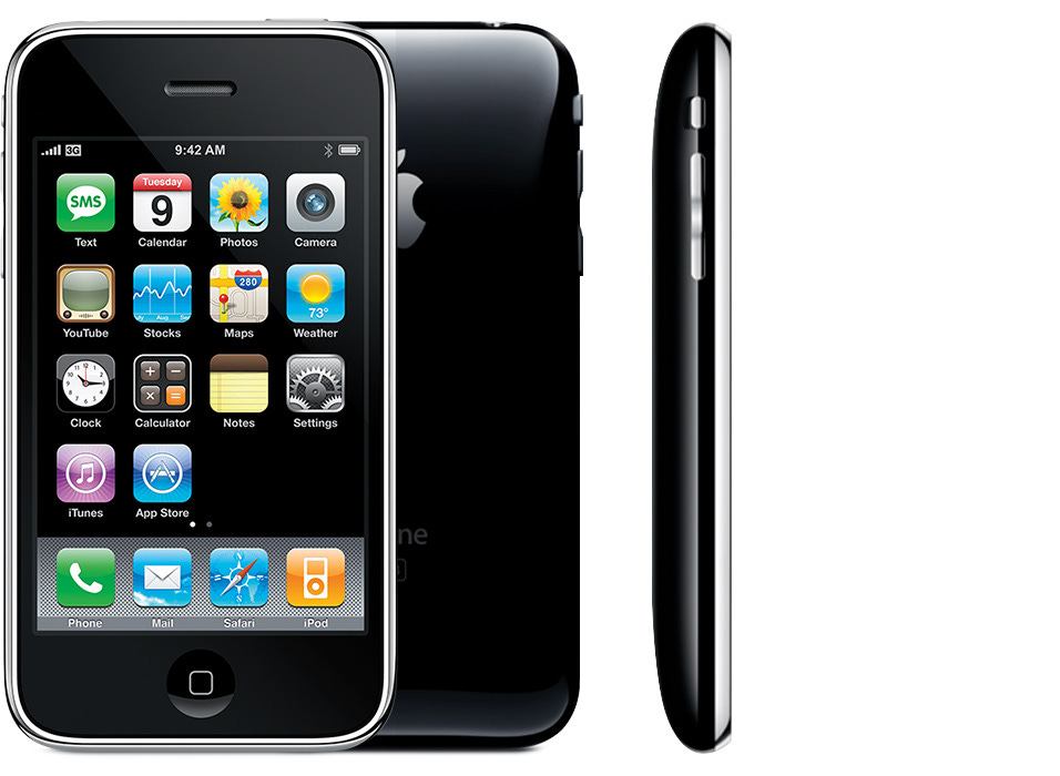
While the personal computer continued to make small tweaks to the existing formula, a new area of development opened up, creating space for radical experimentation. Computers started to get small, small enough to fit in your pocket, and they needed a new kind of interface. Mobile and tablet operating systems abandoned the desktop metaphor, proving the viability of more abstract systems.
It's all an illusion
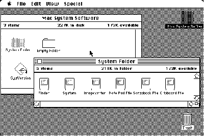
More abstract systems proved useful, but even early GUI users largely ignored the metaphor and interpreted the interface in front of them much more directly.
John Siracusa describes the reaction of early Mac users who were told that file icons represented data on their disk.
...users very quickly discarded any semblance of indirection. This icon is my file. My file is this icon. One is not a "representation of" or an "interface to" the other. Such relationships were foreign to most people, and constituted unnecessary mental baggage when there was a much more simple and direct connection to what they knew of reality.⁸
Users' willingness to view the world of the interface literally was described by Alan Kay and his colleagues at Xerox PARC as user illusion. Kay wrote that "what is presented to one's senses is one's computer".⁹ Under the current system of files & folders, we're forced to perceive our computers as massive sprawling libraries, accumulated over time and organized as best we can manage. However, most of us are poor librarians, preferring to focus on our work instead of file management. These expanses of data often become unfathomably vast, with poorly labeled documents crammed into far-off corners.
In order to navigate through our work, we're presented with lists of names connected to icons. More modern interfaces have replaced icons with minuscule thumbnails, but our primary mode of searching often relies on a "guess and check" technique. How may times have you opened a vaguely named file in an application just to verify you have the right one? Raskin objected strongly to the file-naming convention:
Giving a file a name does nothing more than add a few characters to the file, and you are required to remember the file by that one tiny portion and by nothing else. I count this as one of the major horrors visited upon us by conventional computer systems.⁷
We treat every piece of media like a book on a shelf—we can read the titles on the spine, but have to retrieve and open it to see the contents. This method works fine if we assume all of our content is similar to books, but why would we treat images, videos, or 3D models this way?
Most people feel the file system as displayed is intrinsic to the computer—how could it be done otherwise if this is the computer? But, the file as presented to us is not an intrinsic part of computing. In reality, the file we see in Finder is an abstraction, in many cases obscuring multiple files, metadata, and icons conveniently bundled together behind the scenes. None of this really matters to the user as long as the illusion feels internally consistent.
We're not constrained to represent the file system as it is—the current system doesn’t even do that. An inaccurate, but understandable model is much more useful. So if we're free to create any model we can dream of, why do we insist on rehashing the same tired metaphor?
As it stands, the desktop suffers from:
An antiquated metaphor based on an obsolete mode of work
Opaque representation of assets
An emphasis on manual file management
In some ways, user illusion stagnated progress on the interface, but we can also use it to break out of the rut. If we accept the basic premise that the interface is the computer, we're free to dream up the ideal workspace and form the computer to match.
A new, modern workspace would:
Base its metaphor on actions, rather than real world objects
Represent assets as accurately & fully as possible
Deemphasize file management, removing it from the day to day workflow
Focus on actions
Metaphor itself isn't an issue. In everyday language, we use metaphor constantly: referring to points in an argument as "weak" or "strong", describing a pattern as “loud” or “quiet”. Metaphor is how we make sense of the world, but tying our interface to real world objects introduces too many real world limitations. Instead, our new workspace will focus on actions. We want the elements on the screen to feel tangible, but that doesn't mean they need a physical analog.
A good first step would be to release the bounds of the desktop. What happens when I drag a window offscreen? Normally, it disappears, since the desktop is a fixed space just like a real desk. There have been some attempts to address this with convoluted solutions like multiple desktops, but that ultimately muddies the core concept while inheriting most of its limitations. The simplest solution would be an infinite (or functionally infinite) desktop. From the technical side, this is well-trodden ground and it allows us incredible freedom.
If I want to keep my work contained to a small area, I can easily do so. If I want to spread everything out and get a birds eye view, that's equally easy. I can change my mind later on, contracting and expanding my workspace as needed without creating the dreaded cluttered desktop.
Naturally, we'll want to introduce a couple of tools to navigate this space. Panning lets you control what's in view and modern users are comfortable with scrolling along two dimensions. We'll also want to zoom in and out to focus on details or step back to see the big picture. A pan & zoom based interface also happens to work great for touchscreen devices, which we now use almost constantly. Our goal is to focus on familiar verbs without worrying whether our nouns have real world analogies.
Raskin strongly advocates for this interface, comparing the desktop system to “a little room with a number of doors leading this way and that. The doors’ labels are usually short, cryptic, or iconic, and they may change or disappear”.⁷ A zooming interface on the other hand, lets you rely on spacial memory and more intuitive navigation.
The canvas approach is only one example of an action based interface, and there's the potential to design all kinds of approaches for different use cases. We could develop lots of different interfaces by applying this model to activities like searching, browsing, presentations, and more.
Show the asset
We already discussed how users perceive the icon as the file, but we're limited by named references. Nielsen describes the issue well, writing that users "have no way of peeking inside a file without opening it up and paying the ensuing penalty in terms of performance and screen space".¹⁰ So, our goal is to allow users to peek at their assets at the lowest cost possible.
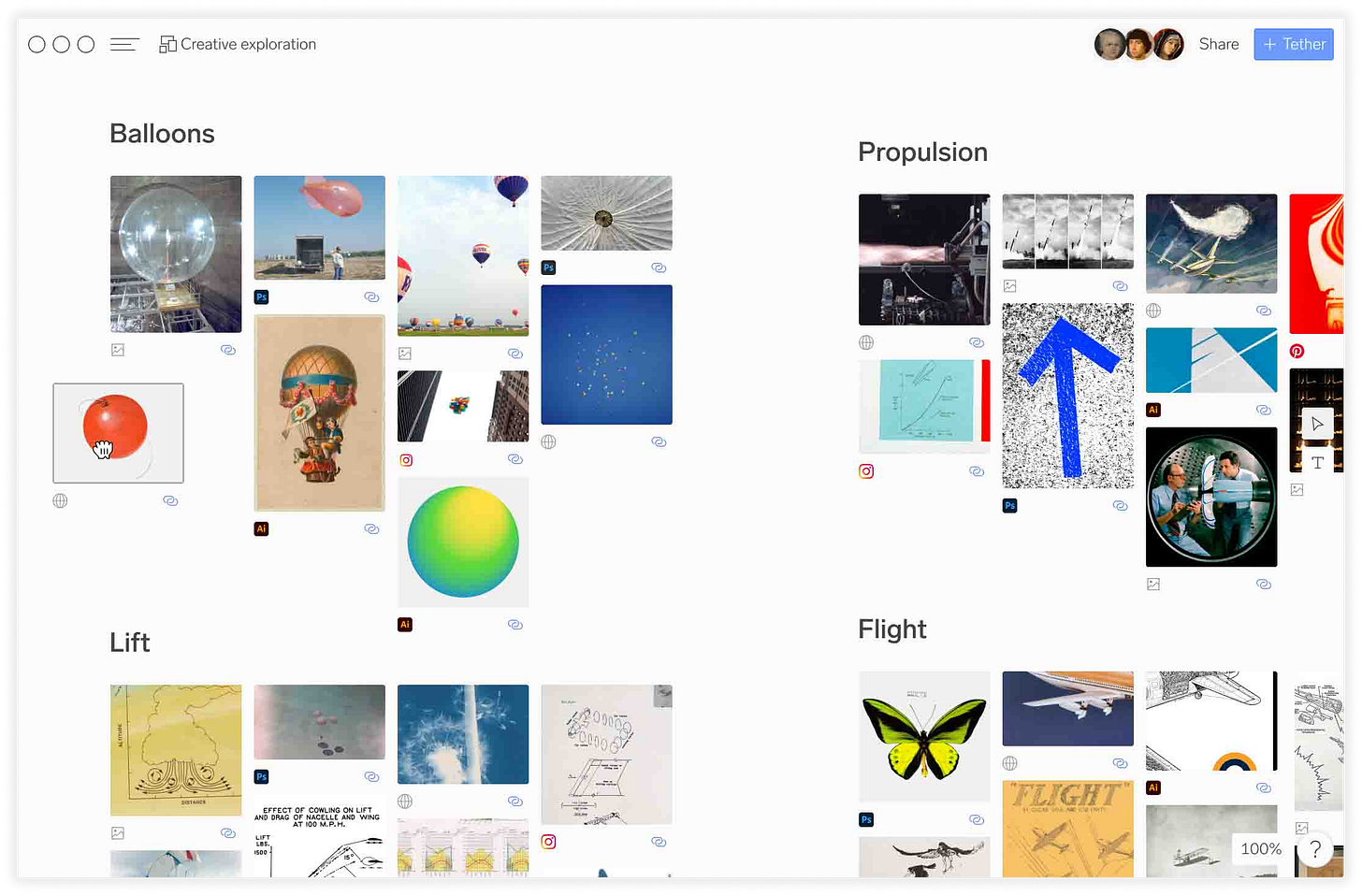
Again, we're taking the simplest approach: just show the asset. At this point, almost all work is done in a graphic interface. Our files aren't perceived as bundles of information, they're images. Currently, we see these images mostly as tiny thumbnails next to long names. Our new workspace would invert this relationship, showing the asset rather than telling you its name.
Instead of hunting for "mockup_final_FINAL_V3.psd", we're now free to skim through assets at full size. Often, we're not exactly sure what we're looking for, so browsing through filenames is a fruitless endeavor. While wandering around the workspace, we're free to stumble on that perfect reference or a long forgotten work in progress. This should introduce a sense of mise en place—with everything at your fingertips you're invited to make unexpected, creative connections.

Lose the file system
This point is probably the most contentious, but it's important to note that we're deemphasizing the file system, not deleting it. For most day-to-day tasks, the file system is a stumbling block. In the spirit of an action based workspace, we want to remove the limitations imposed by this strict structure without sacrificing the underlying information.
For example, I have a folder of cat pictures and a folder of dog pictures. I want to make a new group of the cutest animal pictures, whether they're dogs or cats.
Under the current system, I could drag the originals into a new folder, but now they’ve lost their original grouping. Maybe I could copy and paste the relevant files, but now I've created a sea of duplicates without any relationship to their original location.
What if I never needed to worry about which file is the original? Our new workspace should sit above the file system. Every asset on the canvas can be freely duplicated, arranged, grouped, even deleted without affecting the original. But if the original is updated all of its instances display the changes. This "one way street" relationship would allow us to work much more fluidly, making mistakes, trying out new ideas, discovering freeform associations.
This separation also allows us to use assets from anywhere. Since the workspace is distinct from storage, we can draw from multiple sources. Suddenly it's no longer an issue to mix assets from our local machine, a cloud storage service, and several websites.
Let’s apply this thinking to the cute animals. Now that our workspace is separated from storage, we can start to do some interesting organizational tricks.
I have a smart container that aggregates all the assets from both folders—now I can collect all the animal pictures without reorganizing or duplicating the originals. I can apply a filter to this collection: "Only show me pictures tagged cute". The collection is now a dynamically updating group, adding and removing assets whenever their tag changes. Maybe my source folders are in Dropbox and teammates can collaborate, adding their own images and tagging as they go.
John Siracusa described a version of this idea back in 2003 when he proposed a Spatial Finder. The whole piece is great, but he makes a compelling argument for what he describes as "live search folders":
If you can't think of a situation where you would benefit from a live search folder in your daily work, then you're probably not thinking very hard. Without even getting into complex boolean queries, obscure workflows, or even more exotic metadata like labels, I can imagine almost anyone benefiting from a simple live search folder showing "items created or modified today." ⁸
By separating file management from our workspace, we can spend time doing not organizing. If I need to reorganize on the file/folder level, I can always fire up my dusty old Finder and dig in, but this wouldn't be a part of my daily workflow.
Making it real
Two years ago, I was designing branding & websites in a studio in Brooklyn I shared with my friend, Nick. In between projects, we started kicking around this idea of a new type of desktop—something that felt more like a creative studio and less like a 1980's cubicle farm. We knew from our experience working in the industry that the workflow was broken, so we started sketching.
After countless design iterations, we landed on a system that we believed in. So, we took a big step and quit our day jobs, plunging ourselves into the foreign world of tech, pulling our hair out learning how to start a business, and building the workspace we always wanted. It's called Moss.
Moss is a collaborative desktop that transforms files, folders & links into visuals (even tricky ones like PSDs or videos). Everything is Tethered to its source and accessible directly from the workspace, so you never lose context. The whole workspace is spatial, letting you & your team organize projects in infinite ways.
True to our roots, we're focused on the needs of creatives first: fine art, design, film, 3D, motion graphics, fashion. If your output is visual, we think Moss can be the place to center your work. A space built for creativity, free from the burden of file management and the baggage of the desktop. Use it alone, use it with your team, keep it perfectly organized, or embrace the creative clutter.
Wrapping it up
A system like Moss is large and there are tons of details that we didn't cover, but this framework gives us a baseline to experiment with. To be clear, we're not building a ground-up operating system. As inspiring as the notion is, it's not feasible right now. We’re building a workspace layer that sits above the file system, gathering assets from local & online sources into an interface built for the creative process.
We're currently in a closed beta, onboarding groups from our waitlist and select creative teams. It's incredible to see it used on real projects and we can't wait to share more as we get closer to a public launch.
If you're excited about building a new creative desktop, we'd love to chat. Feel free to get in touch with me directly at aiden@mossworkspace.com.
TLDR? Watch this video.
Want early access to the beta? Join the waitlist on our website.
Sources
Nielson, Jakob. “The Anti-Mac Interface.” Nielsen Norman Group, https://www.nngroup.com/articles/anti-mac-interface/
Bush, Vannevar. “As We May Think.” The Atlantic, July 1945 Issue, https://www.theatlantic.com/magazine/archive/1945/07/as-we-may-think/303881/
CHM. “Timeline of Computer History” Computer History Museum, https://www.computerhistory.org/timeline/graphics-games/
Reimer, Jeremy. “A History of the GUI.” Ars Technica, https://arstechnica.com/features/2005/05/gui/
Augmenting Human Intellect: A Conceptual Framework. Douglas Engelbart, 1962. http://www.invisiblerevolution.net/engelbart/full_62_paper_augm_hum_int.html
SRI International. 1968 “Mother of All Demos” by SRI’s Doug Engelbart and Team, December 9, 1968.
https://www.youtube.com/watch?v=B6rKUf9DWRI&ab_channel=SRIInternationalRaskin, Jef. The Humane Interface, 2000. https://archive.org/details/humaneinterfacen00rask
Siracusa, John. ”About the Finder…” Ars Technica, https://arstechnica.com/gadgets/2003/04/finder/
Kay, Alan. “Computer Software.” Scientific American, September 1984. https://frameworker.files.wordpress.com/2008/05/alan-kay-computer-software-sciam-sept-84.pdf
Nielson, Jakob. “The Death of File Systems.” Nielsen Norman Group, https://www.nngroup.com/articles/file-death/
Additional reading
There's a wealth of writing on this subject from people much smarter than I am. If this is your first encounter with the anti-desktop mob, here are a few more resources to get started:
This is Not my Beautiful House: Examining the Desktop Metaphor, 1980-1995. Everest Pipkin, 2019. https://web.archive.org/web/20211007063531/https://web.archive.org/web/20200714135951/http://www.continentcontinent.cc/index.php/continent/article/view/334
User Interface: A Personal View. Alan Kay, 1989. https://meidosem.com/work/articles/kay1990.pdf
Noncommand User Interfaces. Jakob Nielson, 1993. https://www.nngroup.com/articles/noncommand/
The desktop metaphor must die. Jason Yuan, 2019. https://uxdesign.cc/the-desktop-metaphor-must-die-676fbb34afdb


